

So you’re designing a web application. What should your button order be? Here are some guidelines for deciding on what your button order should be. And besides these cases it doesn’t matter, if you follow what’s below.
To begin with so we are all on the same page, let’s classify buttons as primary and secondary. In most contexts, primary actions are positive actions such as Save or Submit and secondary actions are negative actions such as Cancel or Delete.
Follow platform guidelines
If you are building a desktop or a mobile application, the answer to button order of buttons is simple- follow platform guidelines.
For a PC, this means primary action followed by secondary action.
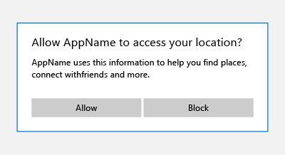
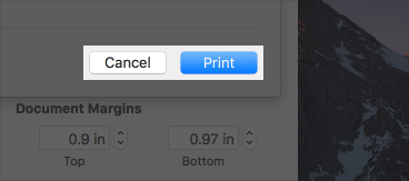
For a Mac, this means secondary action followed by primary action.
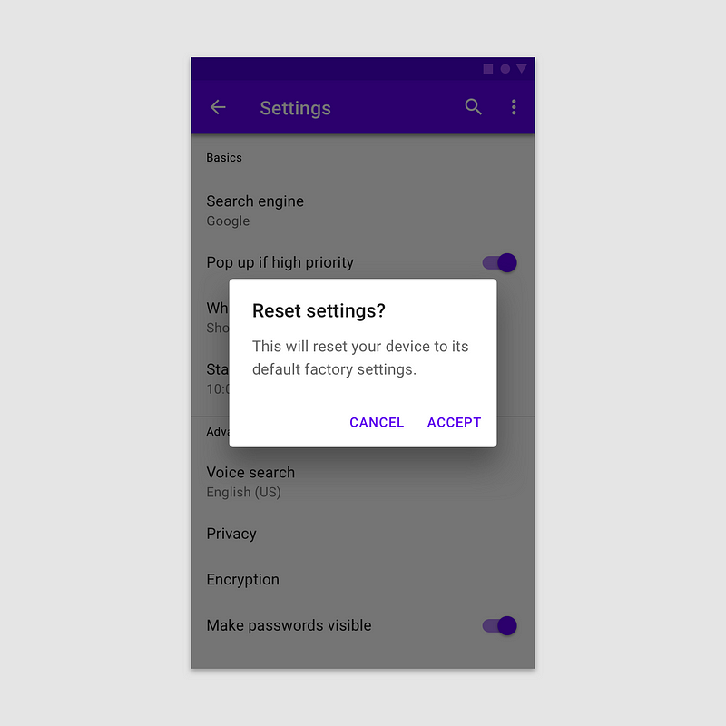
For Android, this means secondary action followed by primary action too.
That was easy. But what button order do you go with for a web application?
Button order for web applications
If you are designing a web application that is provides a service for users of a single platform, it’s a no brainer- go ahead following that platform’s convention again.
If not, then things get a bit more complicated. Users use desktops and tablets and mobile phones. You can have PC users who use iPhones or Androids and you can have Mac users who… well they probably use iPhones more than Androids. Yes, the market share for iOS, Android and OSX to Windows is as of now around 60–40 but that does not mean you optimize for 60% users and not for the remaining 40%. Why not optimize for a 100% of your users?
Button order doesn’t matter if you do this instead- shape and size contrasted buttons
You can optimize for a 100% of your users by not focussing on button order at all. You can go ahead and actually choose whatever order you please. Instead, focus on visual contrast not just through the dimension of colour but shape and size as well.
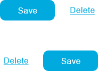
When you have the primary action as a regular button and the secondary action as just text (underlining is optional but it feels better in my experience selling this style to Product owners), you manage to effectively create sufficient contrast for users to easily notice the difference between primary and secondary buttons.
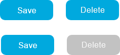
They don’t get confused unlike regular buttons which both have the same shape and size, and are only differentiated by colour. Here are examples below of for both orders, both equally effective in letting users differentiate between primary and secondary actions.
How to transform regular buttons to shape and size contrasted buttons
If you have a design system, updating your primary and secondary application buttons from regular buttons (provided they are placed next to each other and not poles apart) to shape and size contrasted buttons is not hard at all. It should also be an easy sell to your product owner or enterprise design system council because they can be updated without having to worry about positioning. The same goes for updating its CSS if you are building a web. You could practically replace the buttons in your system from regular buttons to shape and size contrasted buttons without having to worry about anything.
- Let’s say either of these pairs are your original buttons.
2. Change the colour of the text for the secondary button.

3. Move them next to each other so they touch each other.

3. Remove the background shape for the secondary button

4. Optionally, though recommended; underline the secondary button text.

Leave a Reply