
I’ve done a fair amount of work in interaction design for data visualisation in MI (Management Information) and BI (Business Information) systems, mostly around setting graphical data representation and interaction guidelines for them. One of the most basic things which people get wrong time and again is when to use tables versus when to use graphs.
Avoid this fundamental mistake. Use these rules to decide whether you should be using a table or a graph to display data (I’ll add more soon because the other points are not just black and white).
Always use a table
- When both your independent and dependent variables* are qualitative
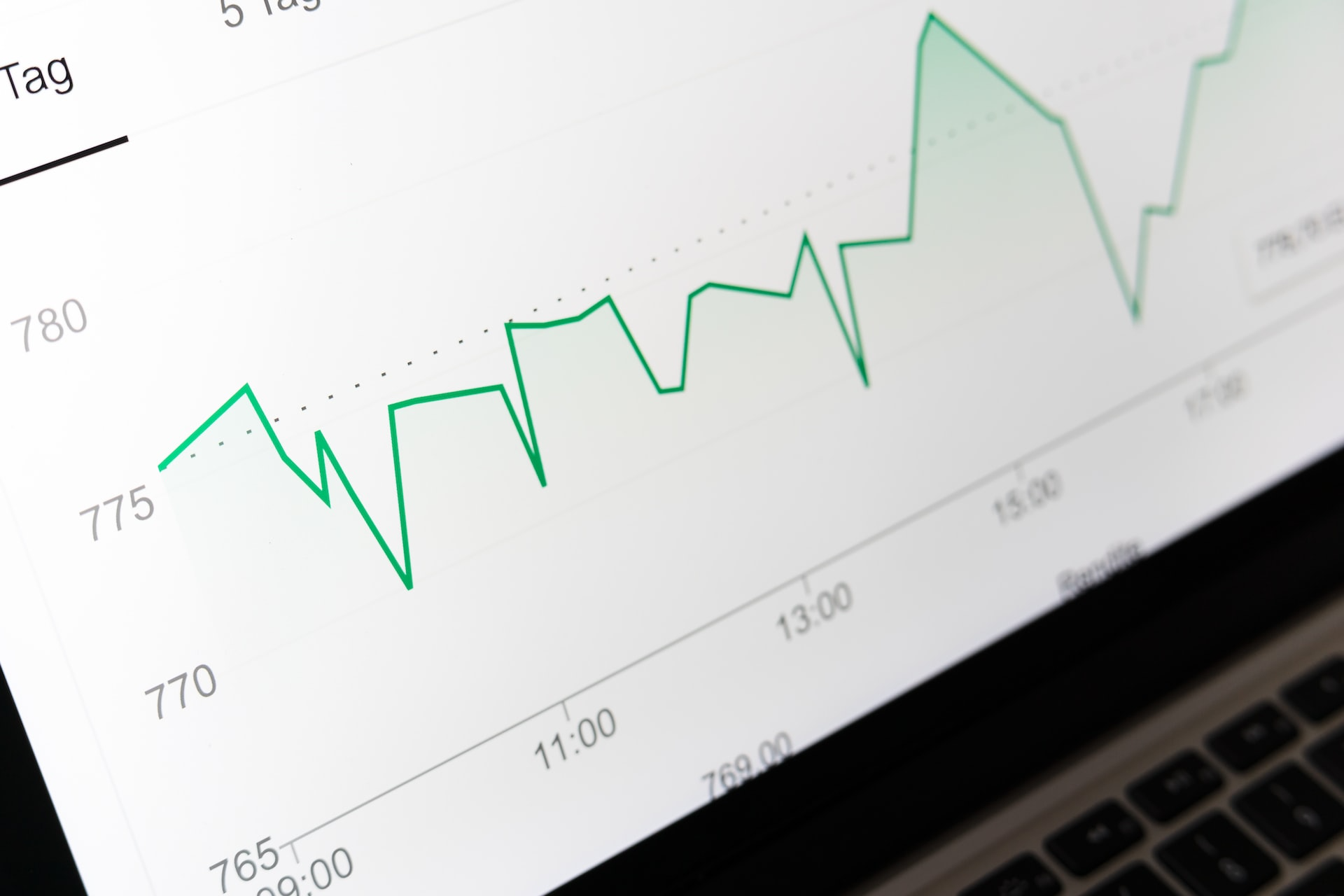
Always use a graph
- When there are more than five data points
* The independent variable is the variable that you are controlling. The dependent variable is the variable that is being measured or observed as a result of the independent variable. E.g. in an experiment to see how choice affects e-commerce checkout, the number of customisation options will be the independent variable and checkout completion rate and time will be dependent variables.
Leave a Reply