
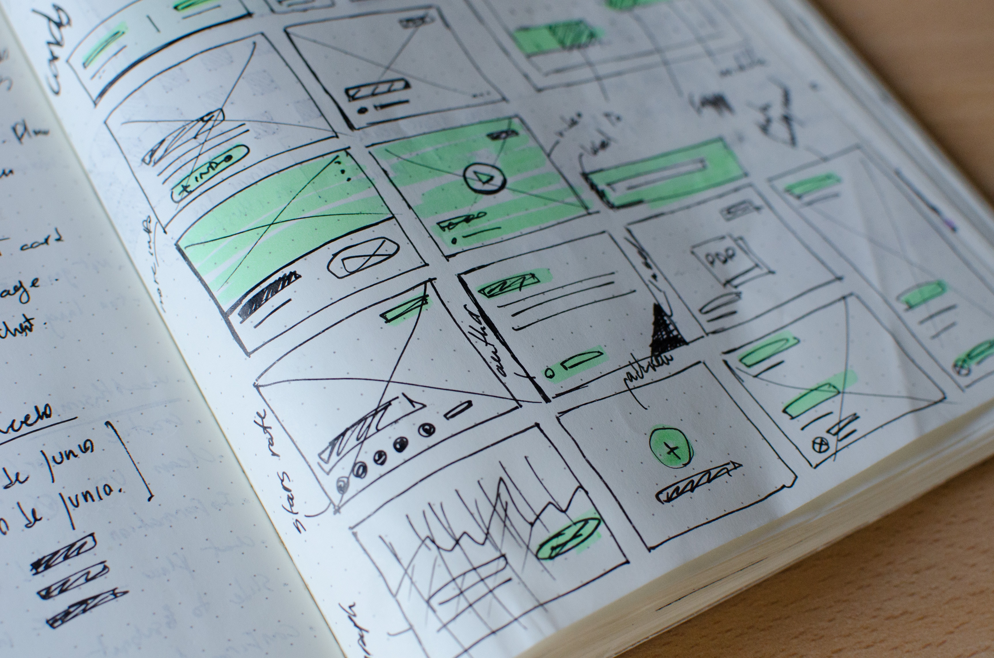
What is a UI pattern?
If you break a website or application down from a user interface perspective, you will end up with a bunch of user interface components that are used again and again throughout it. A user interface pattern is called so because that pattern can be used repeatedly to solve a particular design problem.
Examples of UI patterns
- Accordion- An accordion can be used to display information when there are too many items to fit in a limited space without overwhelming the user.
- Step indicator- A step indicator is used in screen flows to inform users of the number of steps in multi-screen process.
- Progress indicator- A progress indicator is used to shows actual progress of a task being done by something or someone.
What is a UI pattern library?
A UI pattern library is a collection of user interface design patterns. The UI pattern library documents these UI patterns and defines how they should look, behave and often how they should be coded too. It can also provide specifications on templates, flows, and general heuristics.
How can a UI pattern library help an organisation?
UI patterns help an organization ensure a consistent user experience across a suite of websites and applications- in terms of how they look and how they behave, application flow and pages layouts. The greater the number of applications, the greater its use.
The difference between a style guide and a UI pattern library
We will restrict the scope of a style guide to the online channel for this explanation and refer to it as the Web Style Guide. The real difference between a web style guide and a UI pattern library can be explained through what each of them specifically address, and thus their audience which governs the way they are structured.
Both strive for consistency in visual design and interaction covering interactive forms to typography. A style guide’s primary purpose is to ensure that branding is correctly applied to maintain the organizations identity across different websites and applications. On the other hand, A UI pattern library’s primary purpose is to present a set of solutions that address unique design problems. For example, how do you address session timeout frustration for users? How do you address application errors so users are not left disoriented and confused? How do you prevent users from accidentally exiting long forms if they’ve filled them half way through? Since these solutions address design problems, they can increase the efficiency of website and application development with increased usability.
Think of it as extending the value of a style guide rather than a replacement. The style guide’s primary audience is the designer who will refer to it to ensure that the visual design is correctly implemented. The UI pattern library’s audience is the Business analyst, developer and QA (Quality Assurance). Business Analysts and developers, with little or no help of the Usability team (depending upon the importance of the project, availability of usability resources and timelines) can use the style guide to work on the flow and user interface for an application. Even better, developers can pick code samples (HTML, CSS, Java script) to implement the UI pattern. Last but not the least, QA (Quality assurance/ testing team) can use it to verify the correctness of user interface implementation.
The structure of a UI pattern
A UI pattern can include the following sections:
- Name of pattern
- Example image
- When to use it (description of the specific problem it addresses)
- When not to use it
- Similar UI patterns
- Pattern success notes in different applications
- Specifications (platform specific CSS, HTML, Java script)
- Accessibility
- Attachments (e.g.- icons accordion states)
Extending a style guide to a UI pattern library
A style guide can be extended by adding the categories from the structure above that are not a part of the style guide.
The UI pattern library as a web app rather than a document
The advantage of having a UI pattern library as a web app rather than a document is:
- 1. You have a single source of truth rather than different versions of PDFs or other document formats. This means everyone from UX to Product to Development to Testing views the same version always, without any confusion of teams or individuals referring to different versions.
- Lets you look at the UI patterns from different views. For example- organize by looking for a design problem. Organize alphabetically. Organize by layout section.
- UI patterns should be updated, added and retired. A web app makes it easier to do so than a document.
Good examples of UI pattern libraries
- https://ux.mailchimp.com/patterns – A great example for a company specific UI pattern library
- https://developer.yahoo.com/ypatterns/ – A generic UI pattern library but with examples from only Yahoo properties.
A partial list of UI components for a UI pattern library for web apps and websites
Here’s a partial list of UI components to help you get started with your UI pattern library.
- Accordion
- Vertical tabs
- Horizontal tabs
- Step indicator
- Horizontal navigation
- Horizontal navigation (Two level)
- Horizontal Mega dropdown menu
- Vertical navigation
- Vertical navigation (Two level)
- Links (with default, hover, on-click and visited states)
- Form components (with default, hover, focus, on-click states for controls)
- Name lookup
- Combo box
- Multi-select combo box
- Text box
- Form text value
- Label
- Checkbox
- Radio button
- Primary button big
- Primary button medium
- Primary button small
- Secondary button big
- Secondary button medium
- Secondary button small
- Inline edit
- Form layout
- Form sub-headings
- Form groups
- Hint text
- Instructional text
- Help text
- A modular grid based layout addressing several possibilities of standard web applications and websites layouts
- Messaging
- Success message page level
- Success message inline
- Error message page level
- Error message inline
- Tables
- Data table with
- Pagination
- Filter
- Sorting
- Search
- Resizable columns
- Option to freeze header
- Option to freeze first column
- Inline editing
- Data table with
- Processing indicator
- Progress indicator
- Login box
- Modal layer small
- Modal layer medium
- Modal layer large
- Tooltip
- Typography
- Notification badge
- Breadcrumbs
- Facetted search
- Header compact
- Header regular
- Footer compact
- Thumbnails small
- Thumbnails medium
- Thumbnails big
- Video player small
- Video player medium
- Video player big
- Fat footer
- Auto complete
- Carousel
- User card
Leave a Reply