What’s the issue?

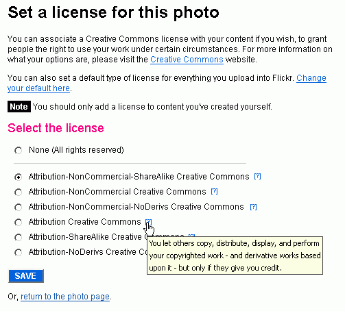
The image summarises the issues with the license selection page on Flickr, which are:
- “Attribution-NonCommercial what?”: What do these licenses mean? Please speak to me in simple language since I do not work at Creative Commons!
The users’ primary goal on this page is to select the appropriate licensing for their photographs. This can be done effectively if they understand how each option differs from the other. Which in turn, requires the users to understand what each option means in first place. - “I have to visit another website for this?”: Flickr’s offering help saying, “For more information on what your options are, please visit the Creative Commons website”, is like the donut guy asking you to make a payment at the common counter situated at the other end of the food court. You would have simply liked to pay the donut guy standing right in front of you instead of having to lug yourself all the way to the counter and back. Similarly, offering help to the user on this page itself would have made sense instead of sending him over to the Creative Commons website to educate himself and come back.
- “Where’s the help?”: It’s not there if the user can’t find it!
Positioning and (unobtrusively) highlighting information pertinent to the user is very important. It’s one of the many things that add up together to deliver a great user experience.
When Steve Krug says, “We don’t read pages. We scan them”, there could be nothing more correct. I certainly believe so, since this is what I observe time and again over the many usability tests I conduct, much as I’ve expected it for the same reasons Steve mentions.
If you look at the image above, I would say that some users might traverse down from the heading all the way to the ‘Save’ button. Then there would others who would skip straight from the ‘Select a License for this Photo’ to the ‘Select the License’ heading. One might be in a hurry, or this is simply the way they have become accustomed to browse (expert users more than novice users). In either case, if the users wants to find out what the licenses mean, they have missed the information that would enable them to do so between the headings.
Users affected
Novice, intermediate and expert internet users who are new to both Flickr and/ or Creative Commons.
Recommendation
Summary
Provide explanation of licenses in page itself. It should be easy to locate yet unobtrusive. There are five solution variations provided to this issue below.
Solution 1

The first solution is effective but not the most elegant and is probably not in accordance with Flickr’s UI guidelines. I say this because I have not noticed contextual help being used anywhere on Flickr as much as I have explored it till now. So it seems it is not a part of their visual framework.
It also increases cognitive load by adding six visual elements to the screen (The contextual help could of course be designed better to minimize this, for example, faded contextual help that increases contrast when the user hovers the mouse over it)
On the next page: Solutions 2 and 3 of the 5 solutions


Leave a Reply